Showing posts with label ANCILLARY TASKS. Show all posts

Monday, 16 December 2013

UPDATED POSTER

I have updated the mock poster using the feedback that I gathered though Facebook, addressing as many of the problems as possible.
I also asked 2 graphic designers their opinions on how the poster could be improved purely for aesthetics as I felt there was something not quite right about it.


Most of the changes I made were quite subtle:


I am now much happier with the aesthetic of the poster since it is much more in the style of Saul Bass posters/title sequences or Pixar title sequences like Monsters Inc and The Incredibles. If we were to use this as our main poster I would want to update it once again to help improve how easy it is to understand. To do this it must reference the film more than it does, this can be done using stills from the film or a tagline.

TB

Friday, 13 December 2013

MOCK POSTER FEEDBACK

I sent a picture of my mock poster to a range of people via Facebook to gather feedback. I asked them to roughly answer these questions:


These were some of the answers I received:


1. Most people noticed the red background first - this was good as the red background was intended to catch people's attention and make it stand out.
2 + 3. Mixed opinions some said they like the font and the harshness of the figures, others said that this was exactly what they disliked about the poster.
4. Everyone liked the style overall except for one person who said that though they did like the simplicity they did think it was maybe too harsh.

An issue that a few people mentioned was that the poster didn't really give any clues as to what it was about, in other words they didn't really understand it. I feel this is the main point that needs to change as it is extremely important that the poster draws people to see the film and to do this people must understand what it's about.

TB

Thursday, 12 December 2013

PAPERWEIGHT


HH

MOCK POSTER

I created a mock poster based around one of my sketches on Adobe Illustrator. The poster is a rough version of what could be our final poster if we wanted to do a more linear style and design. This was based around Saul Bass' Anatomy Of A Murder poster in terms of both colour scheme and style. I was able to quickly put together this poster being already familiar with the program Adobe Illustrator, doing this has given me a better idea of what a poster in this style could look like.


The TYPEFACE was difficult to come by as most of the fonts available in Illustrator were too modern and clean-cut and therefore clashed completely with the style of the poster. I thought back to the Anatomy Of A Murder poster and other posters from around this time and realised that many had hand-cut typefaces. Being unable to find a downloadable font of this style I ended up drawing the font straight into Illustrator using similar ones to refer to. I decided that I liked the mixture of upper and lower case and so would incorporate this into it.

The COLOUR SCHEME was based around the Anatomy Of A Murder colour scheme with the neutral background contrasting with the bright red block and black type and figures. I thought it was important to have a border around the poster as it suits the style.

The FIGURES I tried to make look fairly abstract, whilst keeping the linear style. It was important that the figures kept a balance between looking disassembled but still obviously figures.

The RUBIK'S CUBE was aimed to be the centre of the poster where the eye is drawn to, I am not entirely happy with the distribution of the colours in the cube, but this could easily be altered if we decided to develop the poster.

I have left space for the BILLING BLOCK at the bottom of the poster.


These are the different layers I used to build up the poster that was made up of many different components. By using locks on the different features and layers it made the process of making the poster much more efficient.

TB

LWL MAGAZINE ANALYSIS


TB

Tuesday, 10 December 2013

POSTER SKETCHES

I have done some very basic sketches for 6 different poster ideas:

Quite a convention poster using a photograph that would need to be taken - there are no production stills of this kind. Photoshop would be used to change text on the boxes to titles and credits.


Based on Anatomy Of A Murder poster by Saul Bass. Sole use of graphics that are quite abstract and very simple. Quote from Saul Bass on his method for poster design is on the image above : "Simplify & Symbolize", this is what I have tried to do here.


One of our initial ideas based upon Eadweard Muybridge's "Nude Descending A Staircase".


The Marcel Duchamp version of "Nude Descending A Staircae", again one of our initial ideas.


The final of our initial ideas using the tree collage of 'an autistic brain' however tailored to our film.


An extremely conventional style of poster however with the cereal box separating the characters to make it slightly more interesting. Photoshop would be used to add titles and credits to the cereal box.


TB

Thursday, 5 December 2013

GRAPHICS RESEARCH

As I've mentioned in a previous post the film The Black Balloon has credits at the beginning that could suit our film quite well.


These graphics work well because they add depth to the shots, they are extremely simple, and the addition of the names of the objects in the shot is quite different and interesting.
A similar style is used in the film Stranger Than Fiction, the titles are more complicated however but are used similarly in an interesting way that relates to the film.


Gattaca has an extremely minimalist title sequence using a very basic blue colour palette and straight-forward which titles in a generic font. The style fits well with the film which is very sleek, minimal and simple, this title sequence is a perfect example of how the titles much fit in conjunction with the style of the film itself.


This is the famous Saul Bass title sequence for The Man With The Golden Arm. The use of the bars across the page work with the film since the bars are all skewed and disjointed, a reflection of the narrative of the film. This gave me an idea for our own titles as on the other hand to The Man With The Golden Arm, our film is a lot about the symmetry of some shots, therefore it could work for us to use bars in a similar way except have them all horizontal or vertical to highlight the symmetry.


Finally these are some titles created by Danny Yount for Semi-Permanent Portland. The graphics are beautifully composed and work well by intertwining themselves in with the objects within the shot. They also use lines and reflections to highlight the geometry and perfect symmetry of each shot. The titles themselves are fairly simple and use a modern typeface to match the style.


Having researched these different title sequences I feel that it will be important for our titles to work with the objects in the shot, rather than just look as if they have been stuck over the top. This will give the film a more professional look as well. Also I think it is vital that we use the titles to help our shots look composed and symmetrical, this was the aim for a lot of our film and rushing the titles with actually make the shots look worse.

TB

Saturday, 30 November 2013

ICONIC POSTERS

Nowadays Hollywood churns out at least 10 posters for every film released ranging from the main poster to character posters to teaser posters. However it used to be that 1 poster was produced for a film and was treated more as a piece of artwork than just promotion. This is why many older film posters are more artistic and in my opinion are far more effective, compared to more recent posters which are edited photographs more often than not.

This is a small collection of some of the most iconic film posters of all time:


This poster for Hitchcock's Vertigo was designed by Saul Bass in 1958. The poster is based on a simplified two-colour process that uses hand cut lettering against the orange background. The only figures shown are the hand-drawn figures of James Stewart and Kim Novak. The film on its release was seen as slightly outside the Hollywood normal, more edgy and physiologically complex, this is reflected in the poster through the typeface and abstract graphics.


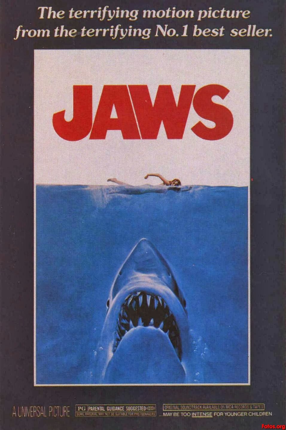
Perhaps THE most iconic poster of all time is the Jaws poster designed by Roger Kastel in 1975. Through one image the poster manages to exploit the audience's fear of the unknown - what is beneath them in the sea. The combination of the blood-red type, thick border and size of the shark in comparison to the girl all add to the impact of the poster. However undoubtedly what makes this poster so great is the impression it leaves on the audience before they have even seen the film, it is truly unforgettable and therefore is so effective.


Stephen Frankfurt's poster for Downhill Racer in 1969 is not seen widely a particularly iconic poster, however in my opinion it should come close. The use of negative space below the up-close photo of these two characters makes for a powerful poster, plus the subtle skier in the centre. These basic elements of the poster manage to sum up the rough plot of the film in a very simple but effective way. The title noticeably does not fill all of the negative space, it is consciously smaller than what would be expected. This can happen because the top half of the poster manages to draw the audience in so well that it draws the eye down to the title at the bottom.

These are some more of the many iconic posters that leave such a mark on their audiences that they can draw almost anyone to see the film:


tb

POSTER IDEAS

Harry and I together came up with some initial ideas for our film poster. We thought about our opening sequence in which Amelie descends the staircase, and this gave us the idea of an imitation of Marcel Duchamp's "Nude Descending A Staircase" which involved one image made up of a still from each shot of Amelie on a different stair. By changing opacity of the stills the stairs would seem to stay in one place, while Amelie is a blur bumping down the stairs.


Our next similar idea was using the same series of stills, but in the style of Eadweard Muybridge's original "Nude Descending A Staircase". Using each still in black and white with a grainy texture to make them look a similar style to the original images.


Another of our initial ideas was after looking at this poster for "Extremely Loud & Incredibly Close". If we wanted to follow a more conventional route for our poster, something similar to this would work well as it is quite and intense and full-on close-up. The fact that the boy has his hands across his face fits well with our film as it reflects the feeling of being trapped that our characters feel.


The final of our initial ideas was based around an image we found called "An Autistic Brain". It is a collage which we both thought that when tailored towards our film could be and interesting and more quirky way of presenting our film.


TB

Tuesday, 16 July 2013

MAGAZINE REVIEWS

A comparison of Little White Lies, Sight & Sound and Empire review pages of different films. To compare how the style varies when the magazine has a different target audience.

Empire has a 76% male ABC1 audience, typically appealing to the masses.
Little White Lies tends to appeal  to a more "arty" audience, people who like the magazine to be more quirky and interesting to read. They also are happy to put more time and effort into reading the magazine.
Sight & Sound appeals to a more niche audience that Empire, however is less artful and more focused on content. It is far more wordy than the other two magazines.


TB

Sunday, 16 June 2013

EMPIRE MAGAZINE COVER ANALYSIS


An analysis of the front cover of an EMPIRE magazine to show the basic construction of a magazine cover that would appeal to the magazine's main affluent male audience of ABC1.