Showing posts with label RESEARCH & PLANNING. Show all posts

Thursday, 30 January 2014

MAGAZINE LOGO


This is the logo I have made for our magazine branding, the magazine is called United Film. The 'M' with the film reels makes up two people who are uniting - the film reels are their heads, also the top half  of their bodies is made to look like a clapperboard. These things all fit in with the title of United Film. I drew the logo on Adobe illustrator from a sketch that I did.

Monday, 20 January 2014

IDENT PLANNING

We have come up with the production company called:

TREETOP INC.

For an animated ident using this name I sketched a short storyboard. The ident could be made using an image or illustrator drawing of the tree with its roots, the camera would then move up the tree from the roots to the treetop and then pull back to show the whole image. The text saying the company name would then pop up next to the tree. We will have to use motion to create the look of the camera movement, and could also possibly use it to make the image/drawing look slightly 3D at the start until the text has appeared, then the image turns to a silhouette.

Wednesday, 8 January 2014

ARTHOUSE FILM IDENTS


Film Idents vary in style and length, very often to suit the film they're working with, several of the idents below for example, use a timeless effect either by using scale and themes such as the earth or the brain, others including a variety of characters and locations to show the proportion of the company. Other companies use a very simple technique and logo, often when they're starting off. 


The most important thing in a film ident is the logo, to have company success, you want your audience to recognise your logo, each of the ident's below has a very clear logo that always comes at the end of the clip. Length's vary from 5-17 seconds depending mostly on the wealth and popularity of the company. Often ident's change with wealth & popularity, effects such as 3D animation are used to do this. 

Unless and ident only deals with a certain genre such as Film Noir or Thriller, it's important that they can apply to any film, this most often comes through simplicity, which all of the ident's have, we may not know precisely where we are or what's happening but we get an excellent sense of the type of company.

CURZON FILM WORLD


This ident gives a feeling of knowledge and being central to events, the abstract computerized object looks rather like a brain or some kind of control centre, in it's background is a large spherical object, resembling earth. This makes us think of scale and innovation, the sparks of the maze suggest a hint of new things to come from this company.


BLUE HEAD FILMS


This ident is very short and simple, it goes from a very modern, technical looking pixel screen that transforms into a tribal design face and bold, simple lettering. Giving the effect of old and new combined to create one another.


SNASK FILM


This longer ident, gives a sense of money, it's very high definition and set-up very cleverly with smoke and lights timed precisely so we almost can't make out what the company is called. The black and white palette makes the film feel very timeless and gives a sinister edge when combined with the sound effects and background noise. 


ENTER FILM


This ident immediately says comical from it's soundtrack, there is a business and liveliness to it, especially using the bright yellow and film noir silhouette look. The transition between so many locations and characters suggests a longevity and variety within the company that may be attractive to any viewer.


A1 FILMS


This ident is the shortest of the one's I've viewed, it very simply animates the company logo with a bright sun like light in centre. The fade of the light and very simplicity of the logo gives it an innovative feel, like the birth of a new era or company, there is something not yet formed in the simplicity. The colour palette is also quite egyptian, it feels like a hot sunrise and the lettering is timeless. 


SEVEER FILMS


The several version of the one ident shown in this video allow a look at how some more well established companies have changed their ident's over the years but stick with the same logo, often to suit the film it's used in, or to give a different impression to the audience. The last ident for example, shown on the preview screen above is in full 3D with a red-hot iron stamp as the f, suggesting that the company is making its mark, or possibly already has. This version is far glossier and more hollywood than the 2D versions shown in the first edition which includes it's website at the end of the ident. This progression is a sign of wealth and popularity within the company, they no longer need to put anything other than the logo in their ident. Large conglomerates such as Universal and Disney are able to do the same with their idents. 


ENTRACTE FILMS


This very simple ident is replayed several times here using slightly different colour schemes, this company made films mainly in the initial use of colour cinema, it's a retro feel today and you can imagine it being used with an 'old film' effect on the computer. There is a sense of that 70's/80's new generation technology. The music especially is one of the first computer generated soundtracks used in film idents.


After having looked at several idents and analysed their success it's becoming clear that for a first film with our company the ident should be short and succinct, focusing most importantly on our logo and film company name.


HH

Monday, 16 December 2013

UPDATED POSTER

I have updated the mock poster using the feedback that I gathered though Facebook, addressing as many of the problems as possible.
I also asked 2 graphic designers their opinions on how the poster could be improved purely for aesthetics as I felt there was something not quite right about it.


Most of the changes I made were quite subtle:


I am now much happier with the aesthetic of the poster since it is much more in the style of Saul Bass posters/title sequences or Pixar title sequences like Monsters Inc and The Incredibles. If we were to use this as our main poster I would want to update it once again to help improve how easy it is to understand. To do this it must reference the film more than it does, this can be done using stills from the film or a tagline.

TB

Friday, 13 December 2013

MOCK POSTER FEEDBACK

I sent a picture of my mock poster to a range of people via Facebook to gather feedback. I asked them to roughly answer these questions:


These were some of the answers I received:


1. Most people noticed the red background first - this was good as the red background was intended to catch people's attention and make it stand out.
2 + 3. Mixed opinions some said they like the font and the harshness of the figures, others said that this was exactly what they disliked about the poster.
4. Everyone liked the style overall except for one person who said that though they did like the simplicity they did think it was maybe too harsh.

An issue that a few people mentioned was that the poster didn't really give any clues as to what it was about, in other words they didn't really understand it. I feel this is the main point that needs to change as it is extremely important that the poster draws people to see the film and to do this people must understand what it's about.

TB

Thursday, 12 December 2013

PAPERWEIGHT


HH

MOCK POSTER

I created a mock poster based around one of my sketches on Adobe Illustrator. The poster is a rough version of what could be our final poster if we wanted to do a more linear style and design. This was based around Saul Bass' Anatomy Of A Murder poster in terms of both colour scheme and style. I was able to quickly put together this poster being already familiar with the program Adobe Illustrator, doing this has given me a better idea of what a poster in this style could look like.


The TYPEFACE was difficult to come by as most of the fonts available in Illustrator were too modern and clean-cut and therefore clashed completely with the style of the poster. I thought back to the Anatomy Of A Murder poster and other posters from around this time and realised that many had hand-cut typefaces. Being unable to find a downloadable font of this style I ended up drawing the font straight into Illustrator using similar ones to refer to. I decided that I liked the mixture of upper and lower case and so would incorporate this into it.

The COLOUR SCHEME was based around the Anatomy Of A Murder colour scheme with the neutral background contrasting with the bright red block and black type and figures. I thought it was important to have a border around the poster as it suits the style.

The FIGURES I tried to make look fairly abstract, whilst keeping the linear style. It was important that the figures kept a balance between looking disassembled but still obviously figures.

The RUBIK'S CUBE was aimed to be the centre of the poster where the eye is drawn to, I am not entirely happy with the distribution of the colours in the cube, but this could easily be altered if we decided to develop the poster.

I have left space for the BILLING BLOCK at the bottom of the poster.


These are the different layers I used to build up the poster that was made up of many different components. By using locks on the different features and layers it made the process of making the poster much more efficient.

TB

LWL MAGAZINE ANALYSIS


TB

Tuesday, 10 December 2013

POSTER SKETCHES

I have done some very basic sketches for 6 different poster ideas:

Quite a convention poster using a photograph that would need to be taken - there are no production stills of this kind. Photoshop would be used to change text on the boxes to titles and credits.


Based on Anatomy Of A Murder poster by Saul Bass. Sole use of graphics that are quite abstract and very simple. Quote from Saul Bass on his method for poster design is on the image above : "Simplify & Symbolize", this is what I have tried to do here.


One of our initial ideas based upon Eadweard Muybridge's "Nude Descending A Staircase".


The Marcel Duchamp version of "Nude Descending A Staircae", again one of our initial ideas.


The final of our initial ideas using the tree collage of 'an autistic brain' however tailored to our film.


An extremely conventional style of poster however with the cereal box separating the characters to make it slightly more interesting. Photoshop would be used to add titles and credits to the cereal box.


TB

ACTOR'S RELATIONSHIPS

By using a mother and daughter to play the leads in our short film we hope to capture that relationship with greater ease. Rachael & Amelie hopefully will be able to create the tense relationship that we need on screen, by having Amelie's mother there, there will be a responsible parent to discipline her if needed and help explain to her what we need her to do.

We feel they are an appropriate pair because they are both blonde and attractive, we want the audience to see beauty within the situation as well as upset and sympathy, Amelie isn't a bad child just a sad result of her disability. You can see a clear resemblance between them and because of their relationship there are many photos of them documenting times when both were younger so in the photos around the house and on the windowsill we can see the progression of time and a far younger Emma.


Monday, 9 December 2013

CREDITS TEST


I did a short test for a way of incorporating the credits into the objects within the shots. This test shows the actors name of Amelie on the cereal box when she is sitting behind out of focus.


I constructed this using Motion Graphics  for a Final Cut Title. I had to match the colours of the text to try to make it look as if it could actually be printed onto the cereal box. If we used this technique for our actual credits in our short film we would also have to use motion tracking to compensate for the slight camera shake, as this test shows the cereal box moves slightly whilst the text stays still. If this were the real thing I would also like to get the text to move with the box as Amelie pours cereal from it.

In motion I had to cover the original text on the cereal box with 2 shapes which I matched colour to the brown on the box. I then layered the text of the actors name over the top of the shapes and tried to make it look as similar to the rest of the text on the box as possible. Layers were key to use as they determined what was visible in the final test.


TB

Thursday, 5 December 2013

GRAPHICS RESEARCH

As I've mentioned in a previous post the film The Black Balloon has credits at the beginning that could suit our film quite well.


These graphics work well because they add depth to the shots, they are extremely simple, and the addition of the names of the objects in the shot is quite different and interesting.
A similar style is used in the film Stranger Than Fiction, the titles are more complicated however but are used similarly in an interesting way that relates to the film.


Gattaca has an extremely minimalist title sequence using a very basic blue colour palette and straight-forward which titles in a generic font. The style fits well with the film which is very sleek, minimal and simple, this title sequence is a perfect example of how the titles much fit in conjunction with the style of the film itself.


This is the famous Saul Bass title sequence for The Man With The Golden Arm. The use of the bars across the page work with the film since the bars are all skewed and disjointed, a reflection of the narrative of the film. This gave me an idea for our own titles as on the other hand to The Man With The Golden Arm, our film is a lot about the symmetry of some shots, therefore it could work for us to use bars in a similar way except have them all horizontal or vertical to highlight the symmetry.


Finally these are some titles created by Danny Yount for Semi-Permanent Portland. The graphics are beautifully composed and work well by intertwining themselves in with the objects within the shot. They also use lines and reflections to highlight the geometry and perfect symmetry of each shot. The titles themselves are fairly simple and use a modern typeface to match the style.


Having researched these different title sequences I feel that it will be important for our titles to work with the objects in the shot, rather than just look as if they have been stuck over the top. This will give the film a more professional look as well. Also I think it is vital that we use the titles to help our shots look composed and symmetrical, this was the aim for a lot of our film and rushing the titles with actually make the shots look worse.

TB

Saturday, 30 November 2013

ICONIC POSTERS

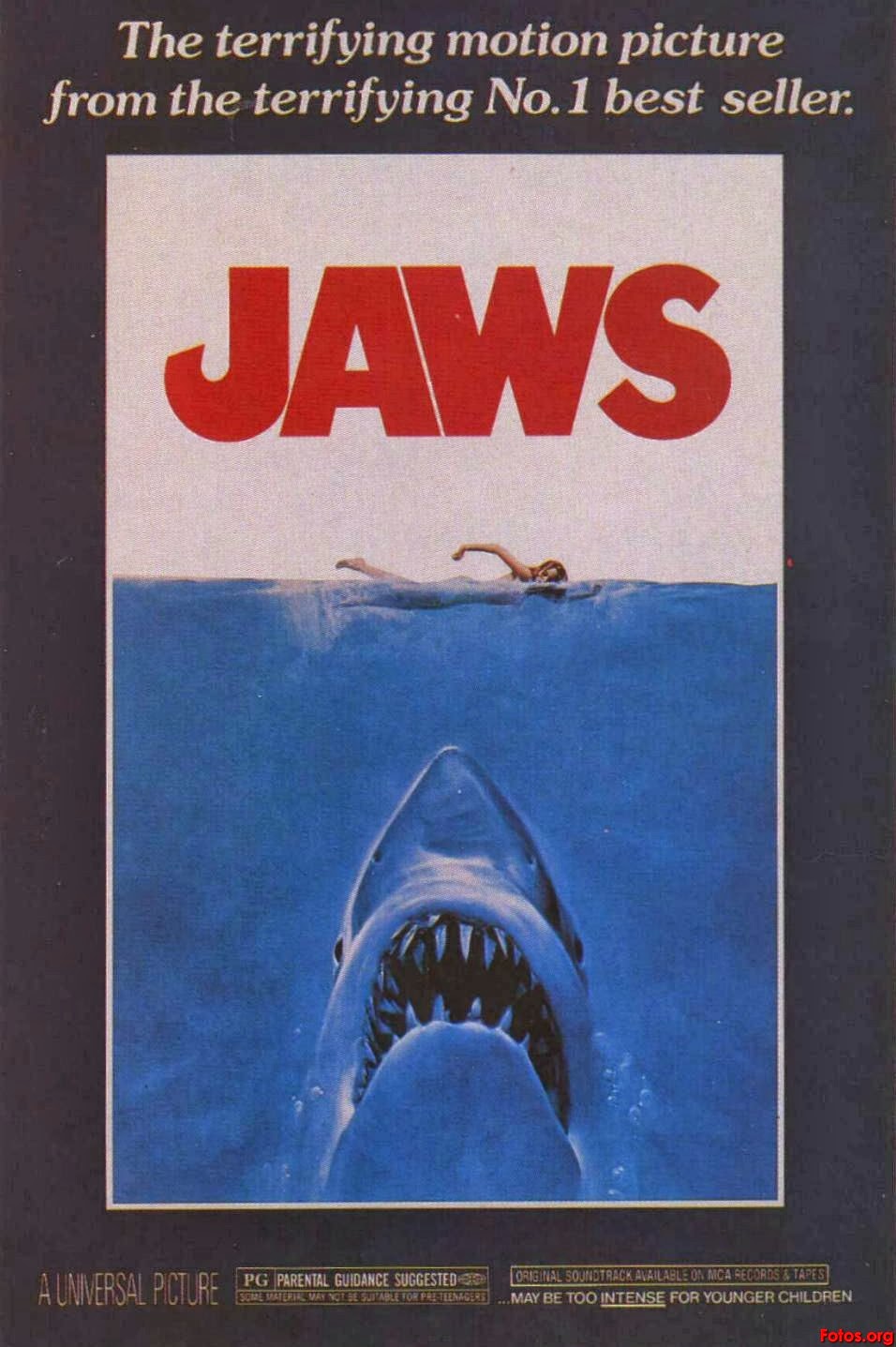
Nowadays Hollywood churns out at least 10 posters for every film released ranging from the main poster to character posters to teaser posters. However it used to be that 1 poster was produced for a film and was treated more as a piece of artwork than just promotion. This is why many older film posters are more artistic and in my opinion are far more effective, compared to more recent posters which are edited photographs more often than not.

This is a small collection of some of the most iconic film posters of all time:


This poster for Hitchcock's Vertigo was designed by Saul Bass in 1958. The poster is based on a simplified two-colour process that uses hand cut lettering against the orange background. The only figures shown are the hand-drawn figures of James Stewart and Kim Novak. The film on its release was seen as slightly outside the Hollywood normal, more edgy and physiologically complex, this is reflected in the poster through the typeface and abstract graphics.


Perhaps THE most iconic poster of all time is the Jaws poster designed by Roger Kastel in 1975. Through one image the poster manages to exploit the audience's fear of the unknown - what is beneath them in the sea. The combination of the blood-red type, thick border and size of the shark in comparison to the girl all add to the impact of the poster. However undoubtedly what makes this poster so great is the impression it leaves on the audience before they have even seen the film, it is truly unforgettable and therefore is so effective.


Stephen Frankfurt's poster for Downhill Racer in 1969 is not seen widely a particularly iconic poster, however in my opinion it should come close. The use of negative space below the up-close photo of these two characters makes for a powerful poster, plus the subtle skier in the centre. These basic elements of the poster manage to sum up the rough plot of the film in a very simple but effective way. The title noticeably does not fill all of the negative space, it is consciously smaller than what would be expected. This can happen because the top half of the poster manages to draw the audience in so well that it draws the eye down to the title at the bottom.

These are some more of the many iconic posters that leave such a mark on their audiences that they can draw almost anyone to see the film:


tb

POSTER IDEAS

Harry and I together came up with some initial ideas for our film poster. We thought about our opening sequence in which Amelie descends the staircase, and this gave us the idea of an imitation of Marcel Duchamp's "Nude Descending A Staircase" which involved one image made up of a still from each shot of Amelie on a different stair. By changing opacity of the stills the stairs would seem to stay in one place, while Amelie is a blur bumping down the stairs.


Our next similar idea was using the same series of stills, but in the style of Eadweard Muybridge's original "Nude Descending A Staircase". Using each still in black and white with a grainy texture to make them look a similar style to the original images.


Another of our initial ideas was after looking at this poster for "Extremely Loud & Incredibly Close". If we wanted to follow a more conventional route for our poster, something similar to this would work well as it is quite and intense and full-on close-up. The fact that the boy has his hands across his face fits well with our film as it reflects the feeling of being trapped that our characters feel.


The final of our initial ideas was based around an image we found called "An Autistic Brain". It is a collage which we both thought that when tailored towards our film could be and interesting and more quirky way of presenting our film.


TB

TITLE POSSIBILITIES/THEMES

We have created a picture & wordle inspiration to come up with our film title which is currently unnamed. After much deliberation I came up with the idea of PaperWeight - the phrase references several moments in the film and the relationship that is the centre of it. A paperweight holds down and restricts what it rests upon as Amelie does with Emma it also refers to the hectic lifestyle Emma leads and Amelie's obsession with tidiness and neatness. 


Thus the film was called


PAPERWEIGHT

HH

Tuesday, 26 November 2013

UPDATE #9

I am finding as I put together the rough cut that we have a lot of footage and it is going to be very difficult to trim it down so much that it is around 5 minutes, it may consist of us having to cut entire sequences such as the rubik's cube or stairs scenes.

I decided that I should make the effort to properly use keywords in Final Cut Events to help organise our footage by location this has made the editing process much quicker and more efficient so far.


tb

Thursday, 21 November 2013

UPDATE #8

We filmed all day Saturday last weekend and managed to get all of the footage we needed well within our time limits. We found Amelie was actually very easy to work with despite the fact that she was only 5 years old, and of course Rachel was very helpful as she is experienced in acting herself. It felt like a lot of work and the day was very full on however it was good to get the bulk of filming done in one go. So far the only thing that we have found we will definitely need to reshoot is the opening stairs sequence as the light seems to change between the shots and the camera moves slightly when it shouldn't. We could have fixed the lighting issue with colour matching however because the camera moves we feel it will be better if we can sort this on location at the reshoot in a couple of weekends.

tb

Saturday, 16 November 2013

INTRODUCTION TO NON-DIAGETIC SOUND

Sound whose source is neither visible on the screen nor has been implied to be present in the action: 
• narrator's commentary
• sound effects which is added for the dramatic effect
• mood music
Non-diegetic sound is represented as coming from the a source outside story space. 
The distinction between diegetic or non-diegetic sound depends on our understanding of the conventions of film viewing and listening.  We know of that certain sounds are represented as coming from the story world, while others are  represented as coming from outside the space of the story events.  A play with diegetic and non-diegetic conventions can be used to create ambiguity (horror), or to surprise the audience (comedy). 

Another term for non-diegetic sound is commentary sound. 

RESEARCH NON-DIEGETIC SOUNDTRACK
In common film music and soundtrack - a producer and director will hire a composer and sound producer to create sound based on information and research that the director/producer provides for inspiration and style. They will attach a storyboard and give clear structure to the sound and when its needed. It's important that if the sound is being created before the film is made that the story and style is very clear so that the wanted effect is created.

With our film we feel it's important that the non-diegetic sound doesn't add all the emotion to the film but that it's an aid. You should be able to watch the film and understand it the same way you would with non-diegetic sound.


Good examples of non-diegetic sound being used and natural sound being enhanced are in my studied short films such as White & Apricot, the sound is very much an aid rather than leading the film where as in Future Proof for example the sound is leading, more like a music video.

HH

INTRODUCTION TO DIAGETIC SOUND

Sound whose source is visible on the screen or whose source is implied to be present by the action of the film: 
• voices of characters 
• sounds made by objects in the story 
• music represented as coming from instruments in the story space ( = source music)
Diegetic sound is any sound presented as originated from source within the film's world 
Digetic sound can be either on screen or off screen depending on whatever its source is within the frame or outside the frame. 
Another term for diegetic sound is actual sound  
• Diegesis is a Greek word for "recounted story"
• The film's diegesis is the total world of the story action   
RESEARCH DIEGETIC SOUND
This article on Sound in Film has helped me learn more about how people use sound and tips from experts. http://www.freestockmusic.com/2011/article/diegetic-non-diegetic/


This website and article gives some really interesting tips and DIY ways of enhancing sound with foley and other enhancements that can be created through Logic/GarageBand or Final Cut Pro. This article emphasises the importance of sound in film and how it aids the storyline, no film is complete without relevant sound, even if it is abstract. http://www.videomaker.com/article/15797-diegetic-sound

HH