This is the logo I have made for our magazine branding, the magazine is called United Film. The 'M' with the film reels makes up two people who are uniting - the film reels are their heads, also the top half of their bodies is made to look like a clapperboard. These things all fit in with the title of United Film. I drew the logo on Adobe illustrator from a sketch that I did.
Thursday, 30 January 2014
Wednesday, 22 January 2014
IDENT FONT
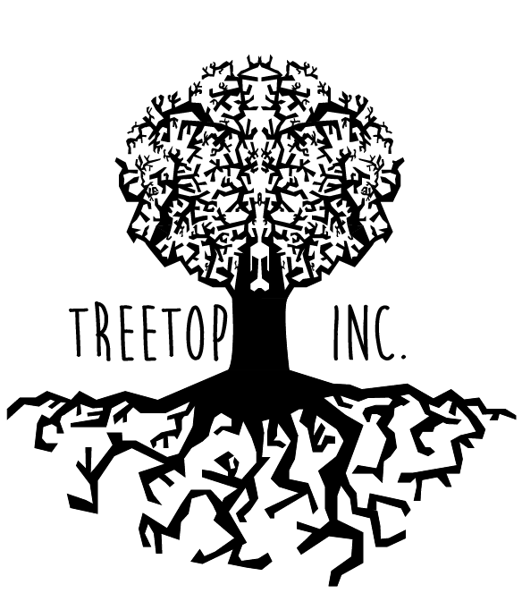
I have created the tree for our ident in Adobe Illustrator. The top of the tree is in two halves which are a reflection of each other, I did this because I really liked the symmetrical look that it gave and it allowed me to make the tree more intricate within the time that I had.
These 4 screenshots are font tests using the fonts:
Chalet Comprime Milan 1960
Moon Flower Bold
Caviar Dreams
CF Alone On The Earth
Harry and I collectively decided that we preferred the font CF Alone On The Earth. We thought that the two more modern fonts didn't fit the style of the tree, and out of the other two agreed that Moon Flower was slightly too light-hearted and friendly whereas CF Alone On The Earth was more jagged and harsh which fitted the style of the tree perfectly.
I will now move each of the letters in the text so that they look as if they are sitting on the top of the roots. There is no full stop for this font since it is a demo font so I will also have to draw a full stop that fits the font's style.
Monday, 20 January 2014
IDENT PLANNING
We have come up with the production company called:
TREETOP INC.
For an animated ident using this name I sketched a short storyboard. The ident could be made using an image or illustrator drawing of the tree with its roots, the camera would then move up the tree from the roots to the treetop and then pull back to show the whole image. The text saying the company name would then pop up next to the tree. We will have to use motion to create the look of the camera movement, and could also possibly use it to make the image/drawing look slightly 3D at the start until the text has appeared, then the image turns to a silhouette.
Wednesday, 8 January 2014
ARTHOUSE FILM IDENTS
Film Idents vary in style and length, very often to suit the film they're working with, several of the idents below for example, use a timeless effect either by using scale and themes such as the earth or the brain, others including a variety of characters and locations to show the proportion of the company. Other companies use a very simple technique and logo, often when they're starting off.
The most important thing in a film ident is the logo, to have company success, you want your audience to recognise your logo, each of the ident's below has a very clear logo that always comes at the end of the clip. Length's vary from 5-17 seconds depending mostly on the wealth and popularity of the company. Often ident's change with wealth & popularity, effects such as 3D animation are used to do this.
Unless and ident only deals with a certain genre such as Film Noir or Thriller, it's important that they can apply to any film, this most often comes through simplicity, which all of the ident's have, we may not know precisely where we are or what's happening but we get an excellent sense of the type of company.
CURZON FILM WORLD
This ident gives a feeling of knowledge and being central to events, the abstract computerized object looks rather like a brain or some kind of control centre, in it's background is a large spherical object, resembling earth. This makes us think of scale and innovation, the sparks of the maze suggest a hint of new things to come from this company.
BLUE HEAD FILMS
This ident is very short and simple, it goes from a very modern, technical looking pixel screen that transforms into a tribal design face and bold, simple lettering. Giving the effect of old and new combined to create one another.
SNASK FILM
This longer ident, gives a sense of money, it's very high definition and set-up very cleverly with smoke and lights timed precisely so we almost can't make out what the company is called. The black and white palette makes the film feel very timeless and gives a sinister edge when combined with the sound effects and background noise.
ENTER FILM
This ident immediately says comical from it's soundtrack, there is a business and liveliness to it, especially using the bright yellow and film noir silhouette look. The transition between so many locations and characters suggests a longevity and variety within the company that may be attractive to any viewer.
A1 FILMS
This ident is the shortest of the one's I've viewed, it very simply animates the company logo with a bright sun like light in centre. The fade of the light and very simplicity of the logo gives it an innovative feel, like the birth of a new era or company, there is something not yet formed in the simplicity. The colour palette is also quite egyptian, it feels like a hot sunrise and the lettering is timeless.
SEVEER FILMS
The several version of the one ident shown in this video allow a look at how some more well established companies have changed their ident's over the years but stick with the same logo, often to suit the film it's used in, or to give a different impression to the audience. The last ident for example, shown on the preview screen above is in full 3D with a red-hot iron stamp as the f, suggesting that the company is making its mark, or possibly already has. This version is far glossier and more hollywood than the 2D versions shown in the first edition which includes it's website at the end of the ident. This progression is a sign of wealth and popularity within the company, they no longer need to put anything other than the logo in their ident. Large conglomerates such as Universal and Disney are able to do the same with their idents.
ENTRACTE FILMS
This very simple ident is replayed several times here using slightly different colour schemes, this company made films mainly in the initial use of colour cinema, it's a retro feel today and you can imagine it being used with an 'old film' effect on the computer. There is a sense of that 70's/80's new generation technology. The music especially is one of the first computer generated soundtracks used in film idents.
After having looked at several idents and analysed their success it's becoming clear that for a first film with our company the ident should be short and succinct, focusing most importantly on our logo and film company name.
HH
Tuesday, 17 December 2013
UPDATE #10
We are about to break up for the Christmas holidays over which we plan to undertake most of our editing. Hopefully we will only need to fine-tune our editing together in the 2 weeks we have to finish off in the new year. All we have left to plan is our ident and edit, we will do both over the holidays so that we have more time for construction of graphics and ident next term.
Monday, 16 December 2013
UPDATED POSTER
I have updated the mock poster using the feedback that I gathered though Facebook, addressing as many of the problems as possible.
I also asked 2 graphic designers their opinions on how the poster could be improved purely for aesthetics as I felt there was something not quite right about it.
Most of the changes I made were quite subtle:
I am now much happier with the aesthetic of the poster since it is much more in the style of Saul Bass posters/title sequences or Pixar title sequences like Monsters Inc and The Incredibles. If we were to use this as our main poster I would want to update it once again to help improve how easy it is to understand. To do this it must reference the film more than it does, this can be done using stills from the film or a tagline.
TB
TB
Friday, 13 December 2013
MOCK POSTER FEEDBACK
I sent a picture of my mock poster to a range of people via Facebook to gather feedback. I asked them to roughly answer these questions:
These were some of the answers I received:
1. Most people noticed the red background first - this was good as the red background was intended to catch people's attention and make it stand out.
2 + 3. Mixed opinions some said they like the font and the harshness of the figures, others said that this was exactly what they disliked about the poster.
4. Everyone liked the style overall except for one person who said that though they did like the simplicity they did think it was maybe too harsh.
An issue that a few people mentioned was that the poster didn't really give any clues as to what it was about, in other words they didn't really understand it. I feel this is the main point that needs to change as it is extremely important that the poster draws people to see the film and to do this people must understand what it's about.
TB
Subscribe to:
Posts (Atom)